
The creative process is a fascinating and interesting journey and one many do not have the privilege to see and appreciate. Architects are creative people spending a great deal of time learning all we can about people’s needs and wants, hopes and desires, and determining the overall opportunities and constraints of a project. Once we have gathered enough information, we begin creating a carefully curated visual summary from our amassed knowledge through multiple iterations and distilling it into a clean final composition we can share. It is not often our clients get to see behind the curtain and witness the messy parts of this creative process. As such, we thought it might be fun to share the creative evolution of our name and logo.
The setup: We intended to become owners in a well-respected mid-size design firm we were working for and helped grow from five to close to twenty people. Through study and discussion with financial and legal advisers during the firm transition process we formed a generically named company to make the purchase of the existing design firm possible. The name was not important at the time as we were buying an established brand. However, long story short, the firm transition plan did not come to fruition. We ended up moving on, and quickly found ourselves the proud owners of a very generic sounding architecture firm.
The goal: Create a brand name and identity mark and logo that becomes easily recognizable and distinct from other firms while being representative of our ideals and values.
The Name:
We started by researching our competition and our inspirations. We found most professional firms are named after the founders and owners using either names or initials; think Miller Hull, Olson Kundig, Cutler Anderson, SOM, LMN, HOK, the list goes on (and on, and on). This approach has worked for many professional firms and successful ones at that, but, like Goldie Locks, it was not “just right” for us. We decided we wanted our firm name to be more than a collection of names or initials. We wanted the name to represent an action of doing and creating while simultaneously eliciting the art and craft of our trade.
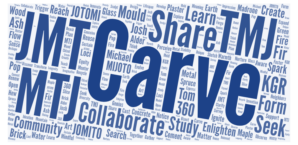
We began collecting words that represented ideas we valued related to design, community, sharing, learning, sustainability, and materials of construction. While sifting through and stirring the word soup we were cooking up, Carve quickly rose to be the top contender. It was a word that represented an action of skill. A process of creating. Shaping. Forming. Doing. CARVE seemed to be “just right” for us.
The Logo:
The part of the creative process where we explore the visual identity of how the logo type and mark for CARVE should look and feel, and it just so happens two of the three founding members actually do carving work as a hobby with one doing linocuts, a form of print making used to leave a mark from a piece of linoleum carved in relief. The beauty and craft from the linocut method of leaving a mark was one that our ultimate logo draws heavily from. Carve Architects looks to leave a positive mark on all the projects we work on.
Now the process to get to our current logo might best be visualized much like the children’s board game of Chutes and Ladders; our explorative journey was a long and twisting path where we would explore one idea in one direction and then suddenly stop, slide back to a previous iteration or idea and try again, always pushing forward to the finish design. Below is a visual timeline of the logo iterations and research images we explored as we worked to draw out what the CARVE logo mark should be. Notice how as we got closer to the final (current) design, the moves become very subtle as we fine-tuned the look.